Your website is your most valuable marketing channel for your business and should be the benchmark for you business brand experience. I work with developers to maximise user experience, brand tone and traffic numbers.
Web Designer Leeds
Web Designer Leeds
Brand design includes web design
Web design and brand design are rarely two separate jobs. They're two sides of the same story. A website built without a clear brand behind it can look sharp for a season and forgettable within a year; a strong brand identity without a website to carry it never gets the chance to do its job properly. That's why we tend to bring the two together from the start: the same thinking that shapes your logo, colours and tone of voice should carry straight through into how your site looks, reads and feels to visit.
Clients who come to me for one often end up glad they did the other too because a joined-up brand and website simply work harder for your business than two disconnected pieces ever could.
Web Design Leeds
Community Learning Partnerships
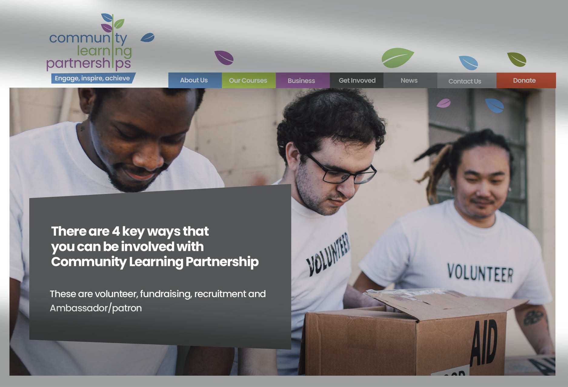
Established is 1991 Community Learning Partnerships are a Leeds based charity operating out of the Shine building in Harehills. They focus on improving education, wellbeing, and employment opportunities for children, families, and adults living in some of the most economically deprived inner-city area of Leeds
We were asked to create a brand new logo and all visual collateral as part of its ongoing development to grow.
The leaf was used to demonstrate growth and new beginings and was integrated into the name.
We have worked for many third sector organisations in Leeds and this was our largest single project of the year.

Synergy Technology
Synergy Leeds is a 40 strong IT company based in Leeds and Manchester, offering services like software solutions, products, and client support
We were involved in the redesign of their website and developed the concept of the honeycomb shape to be included in all collateral and this ‘busy bees’ system was used to represent all aspects of the business including text and image holders.
All photography is people centred.

Tudor Edwards
Nick Cushing is certifying energy efficiency in commercial buildings. His work is around energy performance/efficiency certification for commercial property,
We were involved in the redesign of his website and developed a strong architectural feel throughout using simple black and white images mixed with small, colour images to provide a clean and decisive brand feel throughout.
All photography is architectural.
Vision IFA
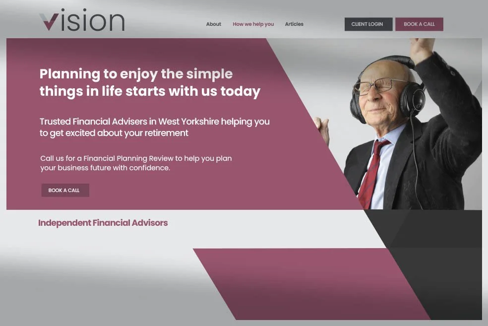
Web design for finance must evoke warmth and trust. Families, couples and individuals are the backbone of Vision and a clean, angular design to represent the ‘V’ of Vision along with strong people centred photography was the key.
Grandpa enjoying his music and Grandma smelling flowers in the garden are the kind of moments you want to capture..
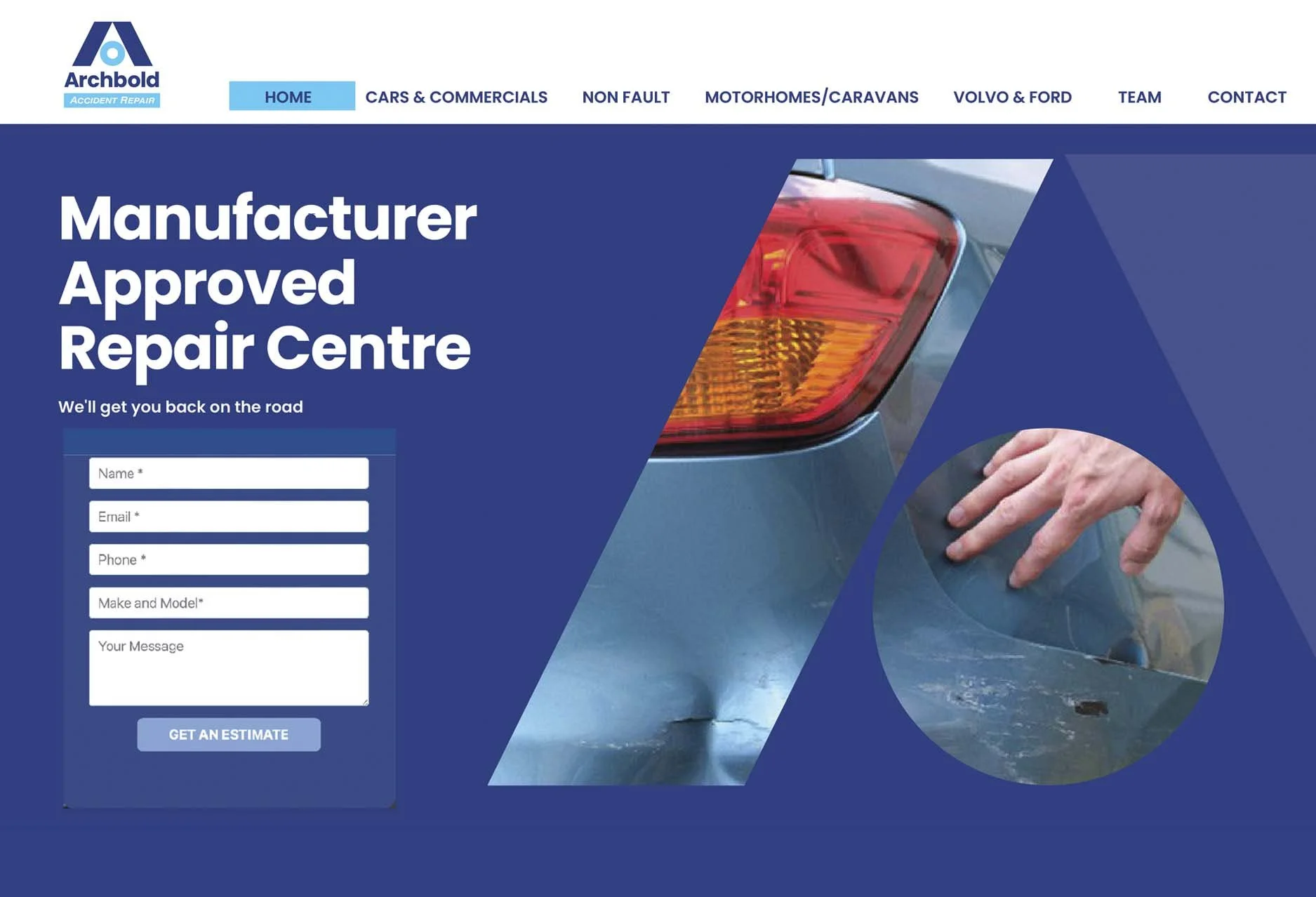
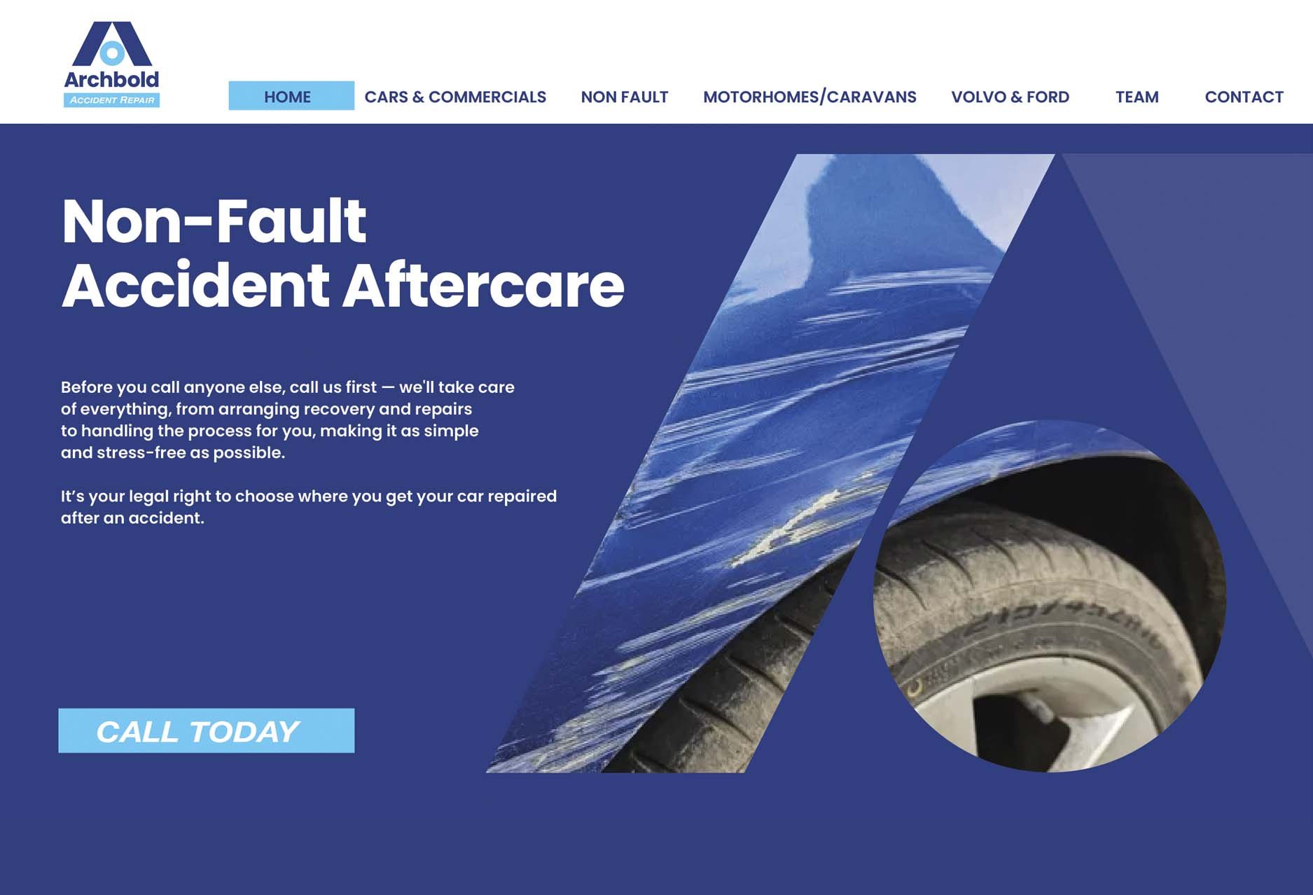
Use of the A for Archbold is a large part of the groups identity. We used this existing shape as a way of displaying close up photography of damaged vehicles.
The simplicity of the images means that the shape is well preserved and visually strong.
The use of the circle continues through the site along with literature, social media and exhibition panels.
The two blues along with a heavy use of white continues with simple, clean, easy to understand information.
All photography is architectural.
Archbolds’ Accident Repair