
30 years of working with both big and small brands means that you get a full creative service based on sound knowledge, commercial judgement and business reality.
Brand Design Leeds
Brand Design Leeds
Brand Design Leeds
Every brand identity we design for Leeds and Yorkshire businesses starts with the same ambition: high-impact branding with a distinctive personality, unique enough to stand out in a crowded market and memorable enough to stick, without losing sight of the commercial reality behind the business. Style matters, but style alone is just decoration; the brand designs that work are built to do a job, not simply look good in a pitch deck. That’s why every project starts with an agreed brief, shaped around what the business actually needs rather than what looks good on a mood board.
From there, everything gets simplified. Good brand design only works if people understand it in seconds, the name, the logo, the message, all reading clearly at a glance, whether that’s on a website, a van, or a business card. None of that works in isolation from the business itself, though. A strong brand identity has to stay relevant to the real story behind the company, its history, its customers, what makes it different, otherwise it’s just decoration borrowed from somewhere else.
Ultimately, that’s the point of getting brand design right: it doesn’t just look good, it promotes growth. A well-built brand identity wins trust faster, holds its value as the business scales, and gives every future piece of marketing, from your website to your logo design — something solid to build on.
Brand Design Projects
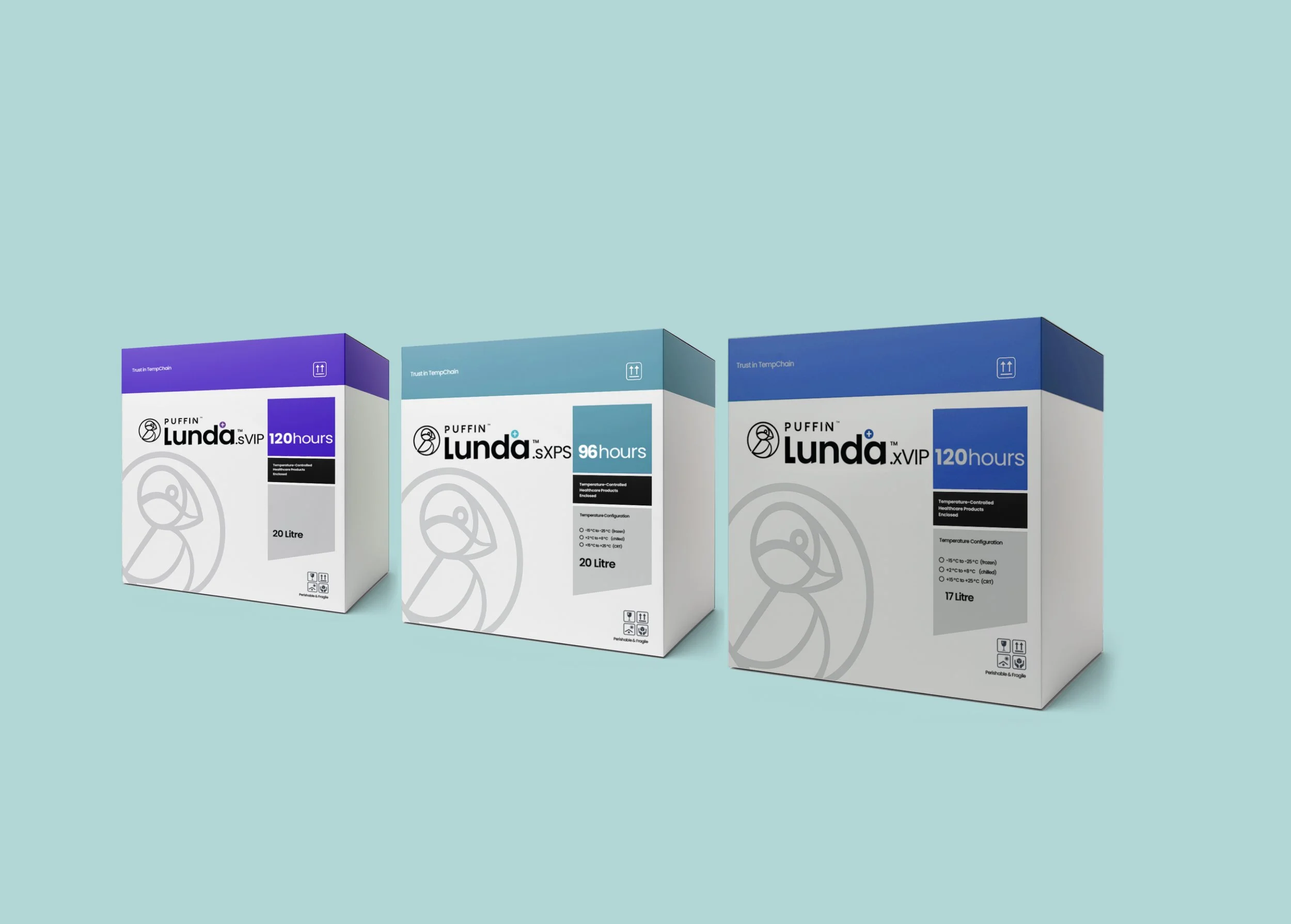
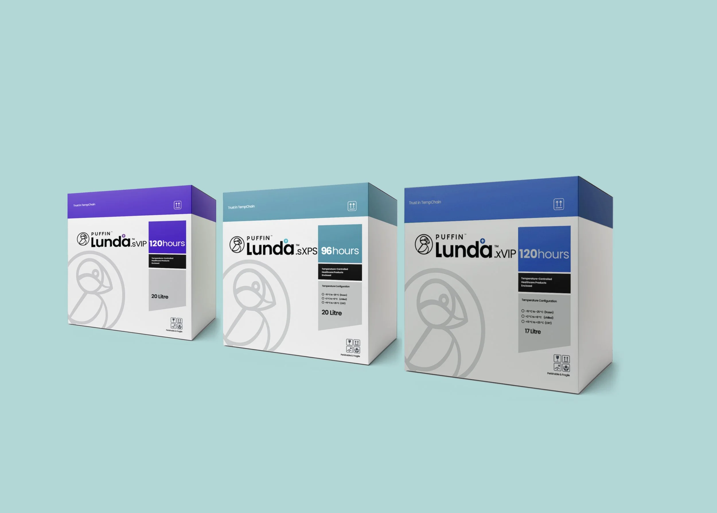
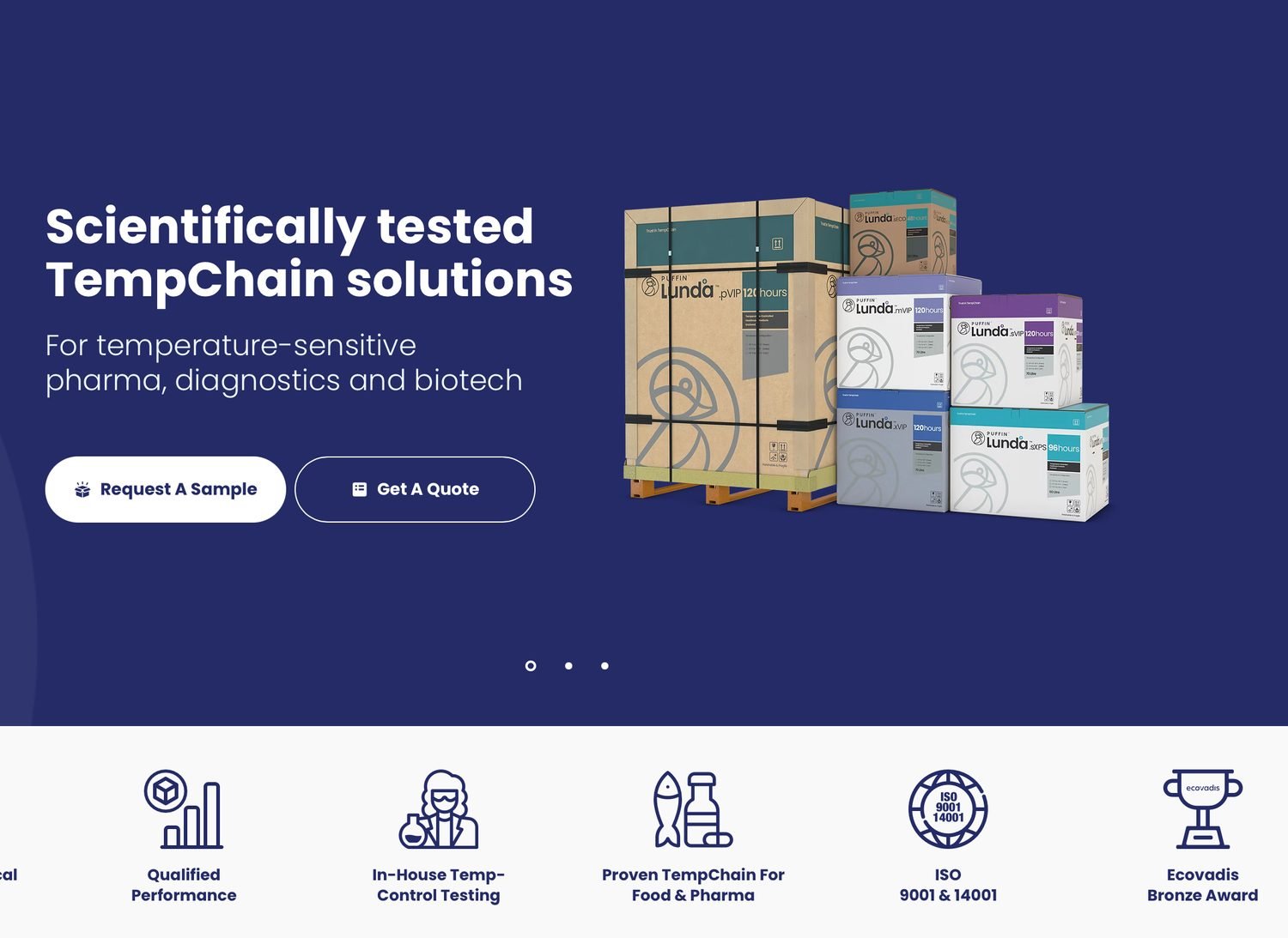
Leeds based Puffin Packaging asked us to create a new brand design and packaging for Lunda, a new kind of temperature controlled packaging.
A range of 5 products enables perishable items to be delivered over different time frames, the longest being 120 hours.
With the increase in demand for weight loss medication Lunda is looking forward to a meteoric rise in sales of its scientifically proven TempChain packaging.
Lunda TempChain

A Leeds based networking group with 120 members in 6 groups that meet every two weeks.
The identity represents a round table with the eight values of networking - inclusion, referrals, integrity, training, 1-2-1 meetings, presentation, support and money - all depicted by its own colour. These colours were used all throughout the website.
The ‘O’ for open also represents the full circle requires for business.
the Open network

Vision IFA - Brand identity
Trust is everything when you're advising people on their money. We built Vision IFA's brand identity with a clean logo, website and stationery around a sharp 'V' that doubles as a tick, paired with honest, real-life photography — professional and approachable in equal measure.

Wattsford’s - safe as houses

We built Wattsford’s brand identity with a simple and meaningful logo and limited green and blue colour palette.
With 60% of Wattsford's clients built around buildings and mortgages, we shaped their logo from a window — a 'W' for opportunity. Four coloured squares represent their core services and now run through every piece of literature, giving this Yorkshire finance specialist a strong, unmistakable identity.
Think Equal - changing lives
A global charity changing how children learn emotional skills needed complex material — 24 books, 90 lesson plans — to feel warm and simple. Strong photography and clear, colourful messaging made that possible.
Naturally Twisted - perfect balance
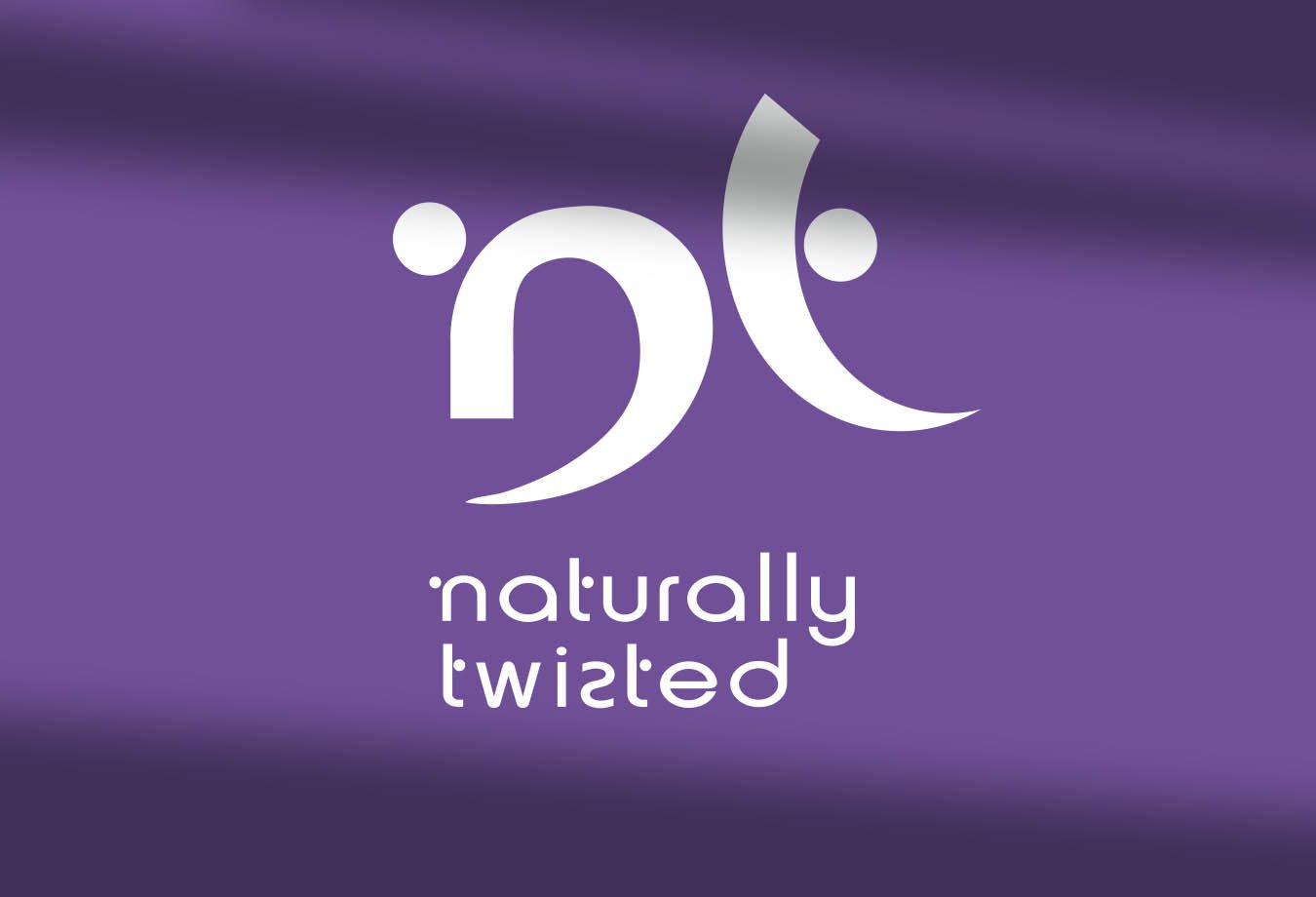
For Naturally Twisted, we developed a custom logo and brand identity built around the shape of the Om.
Om is a sacred sound and symbol in Hinduism, Buddhism, and Jainism, considered to represent the primordial vibration of the universe and often chanted during meditation and prayer.
The twisted icon and modern wordmark convey body, movement and organic beauty, giving this natural care brand a distinctive visual identity across web, signage, and social media.

Thornbrook - the power of live, earth and neutral
Thornbrook is an electrical contracting business and the logo represents the connection between the three important aspects of their services - safety, security and speed.

Sweet success for Parrs
Another Yorkshire business who trusted us to look at their range of sweet packaging.
Bright colourful animal characters were used to pull the range together as a theme. Parrs were delighted to see these little treats make their way off the shelves in good numbers.
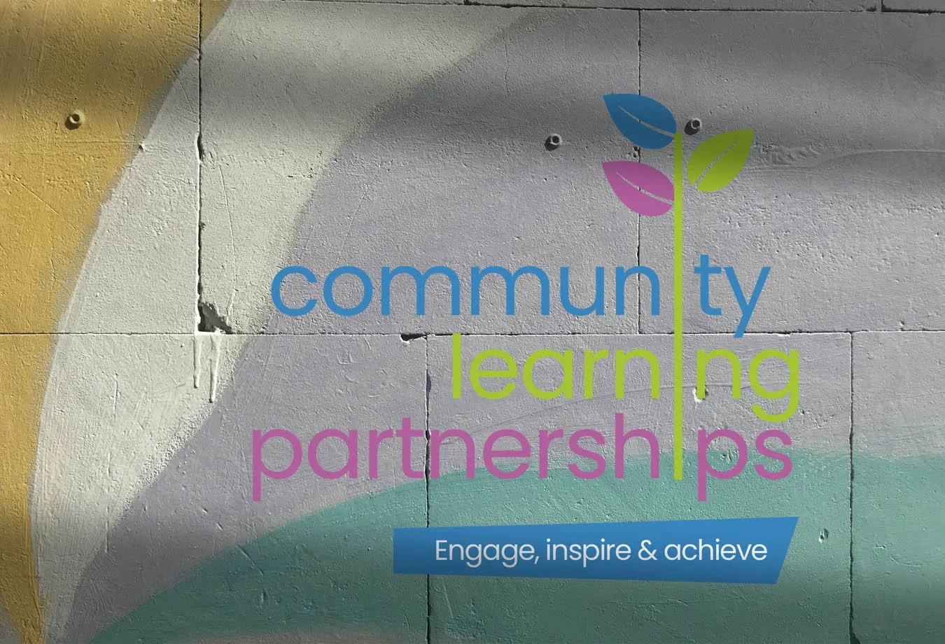
Community Learning Partnerships
We were asked to create a brand new logo and all visual collateral as part of its ongoing development to grow for this Leeds teaching charity.
The leaf was used to demonstrate growth and new beginings and was integrated into the name.
FAQs
What design services do you offer?
We offer a range of graphic design and brand design solutions to meet your needs - whether you're just getting started or scaling something bigger. Everything is tailored to help you move forward with clarity and confidence.
How do I get started?
Getting started is simple. Reach out through our contact form or schedule a call - we’ll walk you through the next steps and answer any questions along the way.
What makes you different?
30 years of design experience
One point of contact
Clear project management system that keeps us all on track budget and time wise