Helping you create your own brand identity

Branding
Asset finance is an important part of business sustainability and growth.
60% of Wattsford client base is buildings and mortgages and so it was felt that a window reflecting opportunity in the shape of the W for Wattsford worked well. Each of the squares represents 4 different aspects of the services and were used throughout literature to convey the business offer.
Wattsford’s are yet another Yorkshire business championing their regions business growth.
If you like us to have a look at your existing brand or are perhaps a start up looking for a meaningful logo for your business then contact us this today.
Web Design
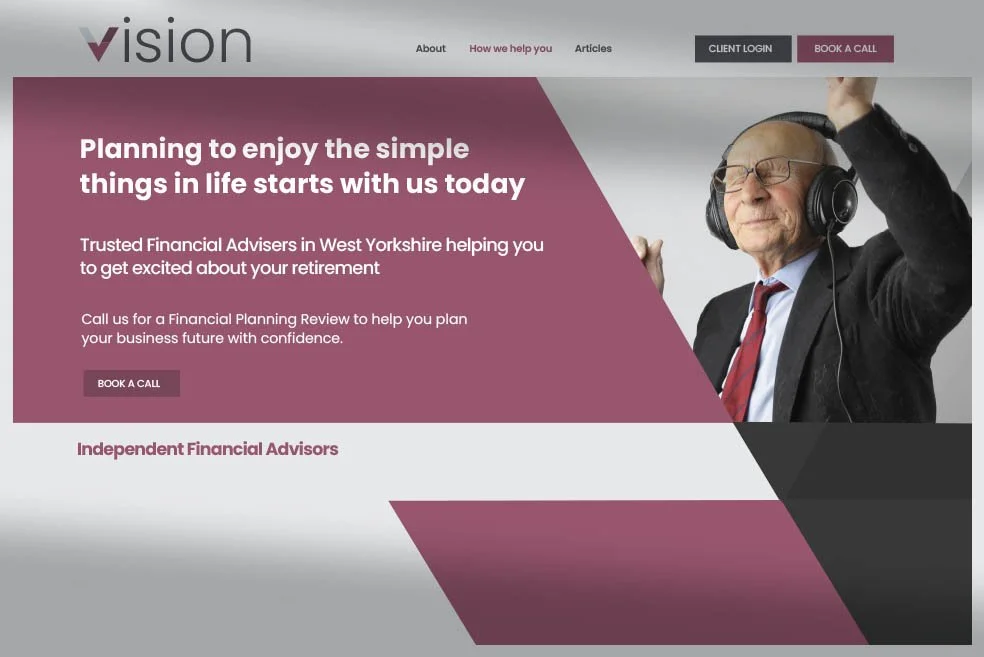
Trust is everything in business and trusting people with your own money is what financial advice is all about.
Vision IFA asked us to design their logo and brand look for their website and stationery.
The ‘V' for vision that also resembles a tick, a hard angular block of colour and the use of real life experience photography all came together to form a very sharp, professional and yet friendly feel.
Vision IFA are a great Yorkshire based business helping both individuals and businesses plan for their financial future. Developing their marketing strategy has enabled them to focus on growth.


Print Design
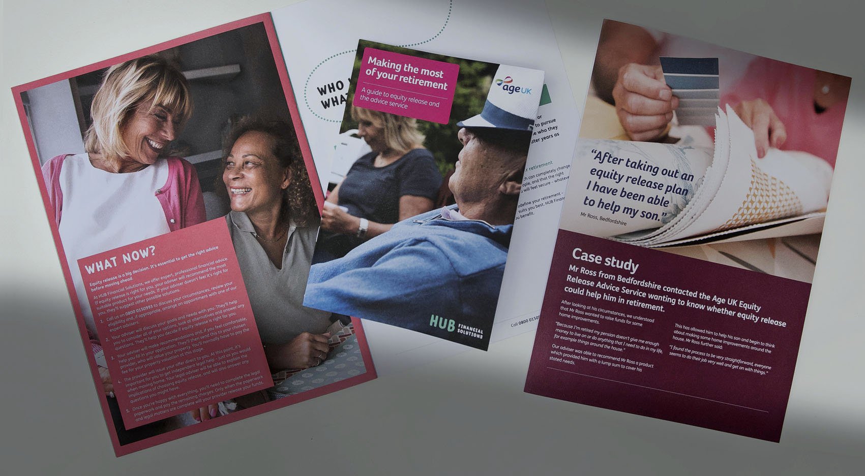
People centred photography was used on JUST’s corporate literature to evoke lifestyle, interests and wellbeing for those planning for retirement.
Single page images and creative and varied shapes form the backbone of all their corporate literature, allowing the technical copy to flow freely throughout.

Packaging Design
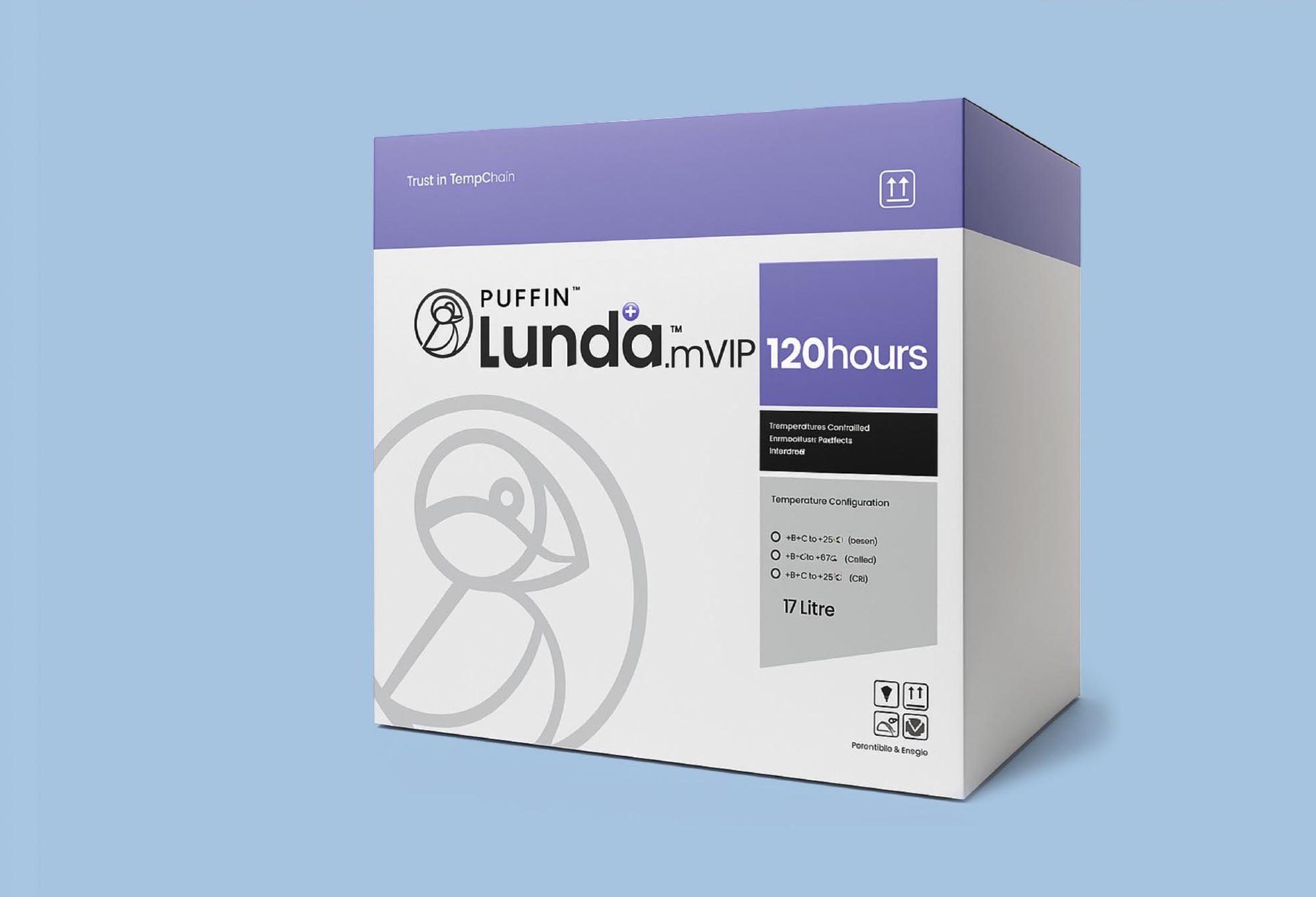
Puffin Packaging required a clean, easy to print, linear design that would appeal to the pharmacy sector. Strong, bold colours were also required to differentiate a full range of products and sizes.
The need for temperature controlled delivery on small items has dramatically increased with the new slimming drugs now widely available. Puffin have used their track record and expertise in such delivery systems to capitalise on this growing market.
Along with the creation of the Lunda brand and design guidelines, we have designed packaging, website and exhibition stand.
We have also produced a new suite of product images and headshots of all the team.

Brand implementation
Think Equal are a global charity promoting a system change in Social and Emotional Learning.
Think Equal's programme has been created with leaders in education, psychology, human rights and neuroscience and comprises of 24 books and 90 lesson plans. We were asked to produce page website guidelines for their new website and with strong photography at it’s heart allow for simple messaging and copy on colourful backgrounds.
Reaching your audience through clear, simple & relevant design
MORE …


Your logo is your book cover. Your brand is your story inside that book.

“David always gets on well with the marketing team. He is reliable committed and loyal which means he fits in perfectly to our brand”
Antony Gore
Head of Marketing at Just

“David is a very talented brand manager who really understands our objectives. We are so delighted with the results which ties in very well with our core Wattsford Commercial Finance business.”
Andrew Wattsford
Wattsford Commercial Fiance

“David has worked across all our marketing material and can see no reason why our relationship will not continue for many years to come.”
David Wynick
Core Financial Planning